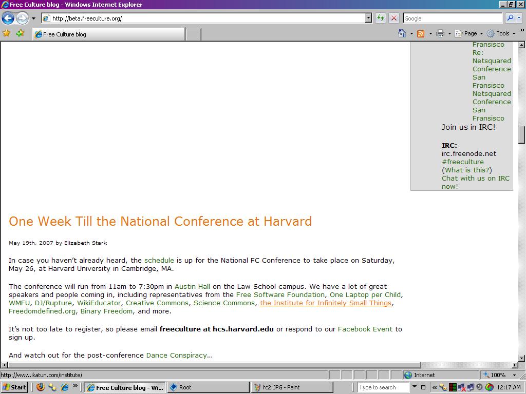
Internet Explorer, why do you make all of my webpages look like ass? I designed all of my sites in Firefox, and validated my XHTML and CSS, and my sites look mostly fine in Opera and Safari/KHTML without any work at all. But Internet Explorer, you just don’t see things the same way other browsers do… you have a very warped view of the World Wide Web.
Internet Explorer, I now must find friends who understand your confusing ways, who can help me build things that look beautiful in your eyes, even though you are a disgusting hack job who makes every intelligent web designer want to puke. I don’t understand why you see things the way you do, and I’m not sure I want to, but couldn’t you try seeing things my way for once?

Internet Explorer, there is no reason why you should be pushing all my content down the page to reside below my sidebar. Is it beneath you to render my blog posts in a reasonable fashion? Why can’t you be like the other browsers and put my text where it’s supposed to go? Isn’t it obvious that I don’t want there to be a page full of whitespace before people can get to reading my material? Seriously, think about it… use common sense, Internet Explorer.
P.S. I hate you.


